The UPre Women program deserved a design that embodies not only its mission but also the strength and courage of UPre women. And that is exactly what Sofia Stráska, a student at the Faculty of Arts at TUKE in Košice, created. The new identity for UPre Women was the subject of her final-year project, and this is how it all came about.
Many final projects end up in a “drawer,” but Sofia’s design will be featured throughout the UPre women program. “For some time now, we’ve felt that the UPre Women program deserves a unique identity that will define it, stand out on social media, and be creative. We reached out to Mária Bujňáková, a graphic artist, designer, and lecturer at the Faculty of Arts at TUKE, and she suggested that she offer the assignment to students as a term paper or final project. The offer was accepted by Sofia Stráska, who was a third-year student at the Department of Design, Visual Communication Studio, at the time,” explains Gabriela Krestián Kuchárová, PR manager for the program and the Carpathian Foundation.
For the first time, I felt that my schoolwork was making a real difference
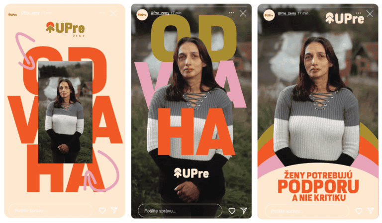
“I’ve wanted to work on a project that helps Roma women for quite some time, so I accepted the offer right away. I think women from marginalized communities have an exceptionally hard time in life—they often grow up in environments that don’t give them the same opportunities as we do, and without support, it’s almost impossible to break free from that. That is why I wanted to contribute, at least through my work, to something that truly matters. Combining graphic design with helping people was a clear YES for me,” says Sofia, for whom working on the design was a very valuable experience: “For the first time, I felt that my schoolwork was having a real impact.” It is a great honor to see that the identity will actually be used. It confirmed to me that graphic design can also have social significance. It is not just about aesthetics, but also a tool that fosters change—it embodies hope, courage, and a new beginning. I worked with the beautiful photographs provided by the foundation and tried to give the entire visual design a positive tone—to symbolize a new beginning. I chose a colorful and vibrant palette. Pink represents femininity, and gold comes from the Carpathian Foundation’s identity, so I incorporated it as a unifying element.”

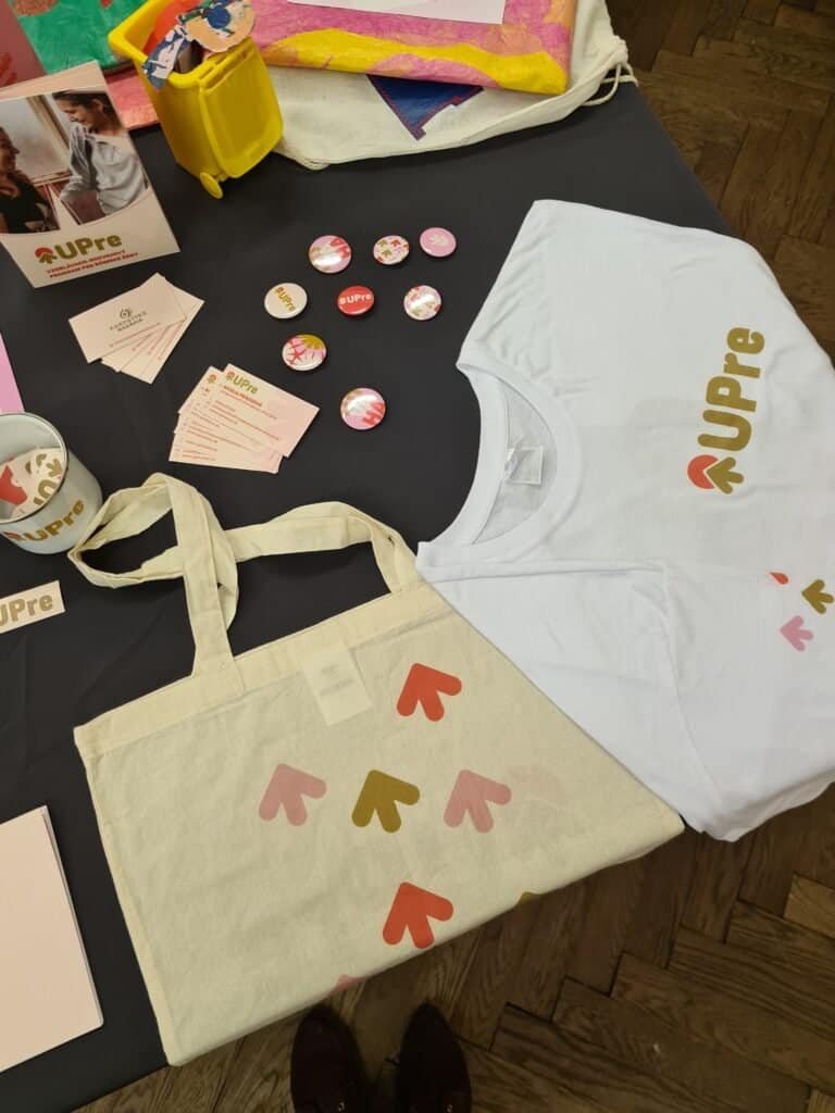
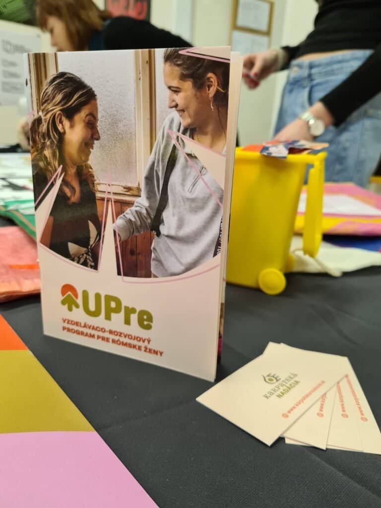
The logo Sofia designed features a symbol of the rising sun—a new day, a new beginning. “I chose a font with rounded edges so it would look friendly rather than strict. The graphic features recurring arrows and arcs as a visual metaphor for growth and forward momentum. I created “Courage” as the central theme of the brand identity. It expresses the inner strength of women who have decided to make a difference.”
We didn’t know how it would turn out
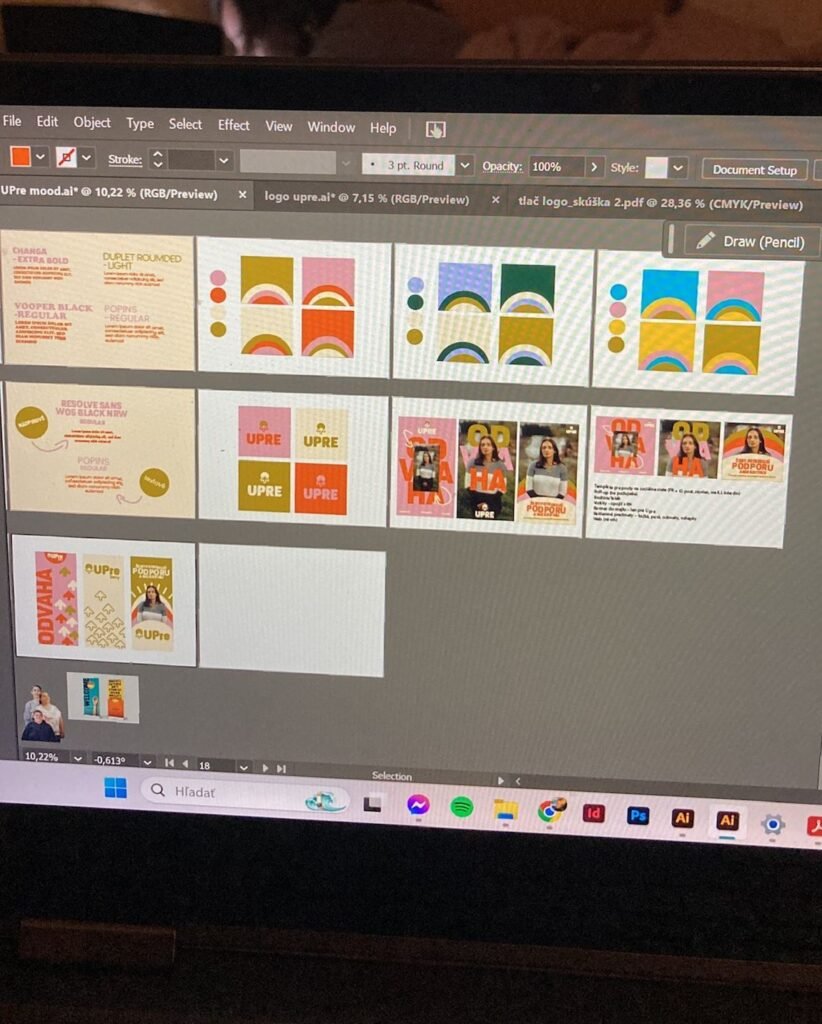
“Sofia prepared three different designs for us, which we tested and sent to relevant people—partners, Roma men and women, people who work in marginalized communities, and regular social media users until we selected the winner, a color combination that appeals to a broad audience and strikes exactly the right balance between energy and empathy, which is essential for our program,” recalls Gabriela Krestián Kuchárová, who goes on to describe her collaboration with Sofia: “It was interesting to establish a partnership with a young student who isn’t yet a professional. We didn’t know what to expect or how it would all turn out. But Sofia approached it very professionally. She responded skillfully to our feedback and changes, and she continued to refine many specific proposals even after the semester ended. She didn’t just create a logo and color scheme; she also proposed designs for posters, flyers, promotional items, and more.” The entire process was supervised by Sofia’s instructor, the acclaimed designer and typographer Samo Čarnoký: “My role in the process is to be a sort of mentor who tries to guide students onto the right path and help them successfully reach their goal. Sofia sketched out several possible paths and developed numerous variations and versions of the logo, from which we jointly selected the most suitable solution. However, the goal was not merely to design a brand, but a comprehensive visual system that is usable across various media and output types for both print and digital applications.”
This is what a win-win partnership looks like
“Working with real clients has taught me to communicate better, respond to requests, and find solutions that are not only visually appealing but also functional,” says Sofia. And what’s the client’s take on this? “We are extremely pleased with this opportunity and collaboration, and we would like to thank the Faculty of Arts at TUKE in Košice. Not only for the new visual identity, but also for the opportunity to collaborate with a student who brought a fresh perspective and energy to the process. Thanks to this, Sofia gained a deeper insight into the lives of people living in exclusion and collaborated with an NGO, which may influence her future direction. Perhaps she will help people in need as part of her profession, and perhaps she will inspire others as well,” concludes Gabriela Krestián Kuchárová.